Typography plays a major role in how people see and understand a design. From websites and social media graphics to posters and product packaging, the right lettering can make a project more attractive and easier to remember. Creative styles such as bubble letters can add personality, energy, and a playful look to both digital and printed designs. Designers can combine different fonts, sizes, spacing, and effects to create typography that fits the purpose of each project.
Use Bold Typography for Strong Headlines
Large and bold typography works well when you want to grab attention quickly. It is often used for website banners, posters, advertisements, and social media posts.
A bold headline can become the main visual element instead of relying on several images. Designers can use thick fonts, strong spacing, and simple backgrounds to keep the message clear.
For print projects, bold typography can make posters easier to read from a distance. In digital designs, it can guide users toward important information such as offers, announcements, or calls to action.
Combine Different Font Styles
Mixing fonts can make a design look more creative when done carefully. A common approach is to combine a strong display font with a simple and readable font.
For example, designers can use decorative lettering for headings and a clean sans-serif font for paragraphs. This creates contrast without making the design difficult to understand.
Avoid using too many fonts in one project. Two or three font styles are usually enough to create variety while keeping the overall design consistent.
Experiment With Hand-Drawn Lettering
Hand-drawn typography can give digital and print projects a personal appearance. It works especially well for invitations, greeting cards, craft projects, posters, and lifestyle brands.
The letters do not need to look perfectly even. Small differences in shape and spacing can make handwritten designs feel more natural.
Designers can draw lettering on paper and scan it into a computer. They can also use drawing tablets and design software to create hand-lettered text directly in digital form.
Add Depth With Shadows and 3D Effects
Simple shadows can make flat letters look more dynamic. A small shadow behind text can create depth without making the design too complicated.
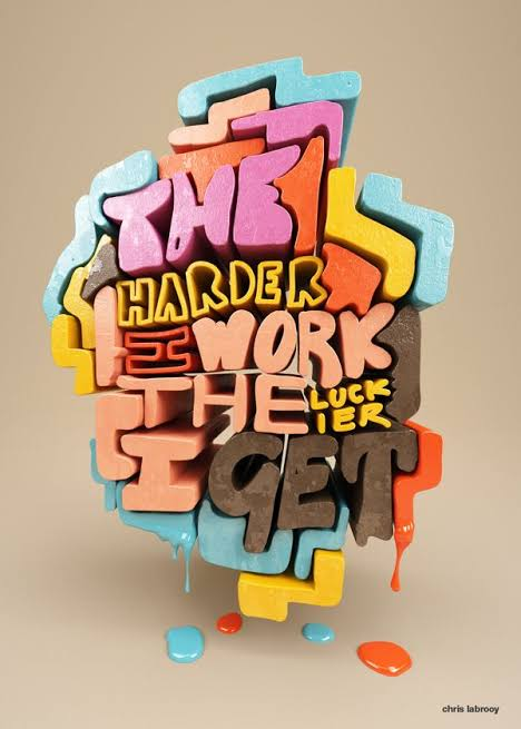
Designers can also experiment with 3D lettering. By adding highlights, outlines, and darker edges, letters can appear to rise from the background.
These effects work well for posters, gaming graphics, event promotions, and social media content. However, designers should make sure the text remains easy to read.
Create Designs With Outlined Letters
Outlined typography offers another simple way to make text stand out. Instead of using fully filled letters, designers can use only the outer edges of each character.
This technique works particularly well with large headlines. It gives the design a modern appearance while allowing background images or colors to remain visible.
Outlined lettering can also be combined with solid text. For example, one word can appear filled while another uses only an outline, creating an interesting visual contrast.
Use Typography Inside Shapes
Placing text inside circles, squares, waves, or custom shapes can make a design more visually interesting. Designers often use this technique for logos, badges, stickers, labels, and social media graphics.
Letters can follow the curve of a circle or fit inside a geometric frame. This creates a structured design without needing many additional elements.
For print projects such as packaging, shaped typography can help important information stand out while supporting the overall brand style.
Try Gradient and Texture Effects
Gradients can add color and movement to typography. Instead of using one flat color, designers can gradually blend two or more shades across the letters.
Textures can also change the appearance of text. Paper textures, paint effects, grain, metallic finishes, and rough surfaces can make typography look more realistic.
Digital designers should use these effects carefully because too much texture can reduce readability. The main message should always remain clear.
Play With Letter Spacing
Letter spacing can completely change the feeling of typography. Wide spacing often creates a clean and premium appearance, while tight spacing can make headlines feel stronger and more energetic.
Designers can also adjust spacing between individual letters to create custom wordmarks or titles. This technique is commonly used in branding and logo design.
Good spacing also improves readability. Letters should have enough room to remain clear, especially when the design will be viewed on smaller screens.
Turn Letters Into Visual Elements
Typography does not always need to act only as text. Individual letters can become part of the artwork itself.
A designer might enlarge one letter and use it as a background shape. Letters can also overlap images, connect with illustrations, or become part of a pattern.
This method works particularly well for magazine covers, posters, album artwork, and creative advertisements. It allows typography and imagery to work together instead of appearing as separate elements.
Choose Typography Based on the Project
Every typography style creates a different feeling. Rounded lettering can feel friendly, while sharp geometric fonts may appear modern and professional.
Before selecting a style, designers should consider the audience and purpose of the project. A children’s poster may benefit from playful lettering, while a business brochure usually needs cleaner typography.
Digital projects also require attention to screen size. Text should remain readable on computers, tablets, and mobile phones.
Final Thoughts
Creative typography gives designers many ways to turn simple words into attractive visual elements. Bold fonts, hand lettering, shadows, outlines, textures, and creative spacing can all help digital and print projects develop a stronger identity.
The best results usually come from experimenting while keeping readability in mind. Designers looking for more lettering inspiration can also explore https://bubble-letters.net/ to see different decorative letter ideas and styles. With the right balance of creativity and clarity, typography can become one of the most memorable parts of any design.